Oct 25
Posted: under artwork, Craft, Horngard, the writing life.
Tags: artwork, revision, the writing life October 25th, 2023
Instead of a snippet in words, a sketch–the kind of thing I often scribble on the back of an envelope or letter or any paper handy…this time the back of a 4×6 card, first with the gel pen and then colored in with colored pencils. I made it Tuesday evening to clarify the terrain and […] [...more]
Instead of a snippet in words, a sketch–the kind of thing I often scribble on the back of an envelope or letter or any paper handy…this time the back of a 4×6 card, first with the gel pen and then colored in with colored pencils. I made it Tuesday evening to clarify the terrain and situation for members of the Discord writing group I’m in–most of them not familiar with my work so not at all with Paksworld. I don’t submit something every week, because they like shorter chunks of things, and that means fragments. But what I often want most from a first reader is not detailed comment, but whether or not the flow of action makes sense or is jumbled. In the first draft, I don’t worry about stuff that may not even be there in second draft. (in fact, in this case I was editing right up to it being my turn because I knew they might have a problem visualizing the terrain without a lot more words than I wanted to spend…this area was described when the allied forced came in several days ago.
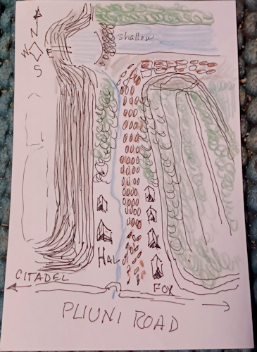
This doesn’t cover the entire area of the ambush sequence but the most relevant bits. The card was white, but messing with the white balance enough to make it look white wiped out the other colors. I need better light in the study. Anyway. North is up. The Pliuni Road leads west and up to the citadel, or east about 10 days’ travel through rows of hills (think the rumples of a kicked rug) to the walled city of Pliuni, about 5-7 days south of Valdaire. That steep cliff on the left (contour lines close together) is the base of one of the “horns” of Horngard. That lower hill on the right (contour lines farther apart) is the first hill east of the big cliff. A waterfall comes down the cliff into a pool (out of scale) with a bar at the east end that makes an easy ford for horses or people. The stream flows east (and is also out of scale). The red-brown seed-shaped ovals represent the horses of Clart cavalry exiting the citadel valley right before the ambush attack from across the stream. Halveric Company (2 cohorts) is camped on the left, and Fox Company on the right. Those triangular pointy bits are tents. Green with squiggles inside is thick vegetation. Ambushments include across the stream, from head-high bushes and young trees, and down from the end of that hill. On the far side of the creek, there’s a hill like the one on this side; the attackers are armed with bows (blackwood longbows, a few crossbows, a few recurved bows) and the brush has been “sculpted'” by careful pruning to allow clear shots with maximum cover. The distance across the creek is only 10-15 yards. The vertical distance from the hilltop is somewhat more, but gravity adds punch.
In version 1 of this sequence, Nasimir Clart and his horse were wounded; in trying to dismount from his horse, an archer on the hill got a lucky hit into the back of his thigh. However, that contradicted the sequence in “Bank Transfer” when he comes cantering across a ford some distance from here (not this ford) and is feeling great. A deep wound in the back of the thigh would not let him ride again that soon, so the first major change in the story was changing out where he was and giving the injury to someone else. (Sorry, Reassigned-Victim.) Clart has not been a POV character before, and once turned loose he proved a superb one, producing good plot faster than I could write it.

Jun 30
Posted: under ARC, Collections, Life beyond writing, Marketing, Story, the writing life.
Tags: artwork, Life beyond writing, the book business, the writing life June 30th, 2023
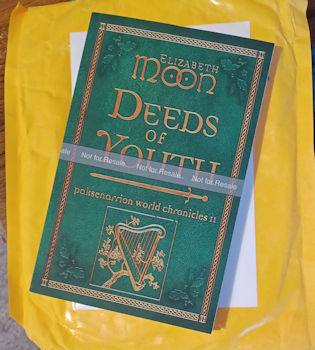
The proof copy of Deeds of Youth, that’s what! Because I’m a writer with a fat glob of Ego, I took a picture of it lying on its padded yellow envelope for posterity or at least later gleeful gloating over just as I’m sitting here now with the book beside me, periodically opening it and […] [...more]
The proof copy of Deeds of Youth, that’s what!
Because I’m a writer with a fat glob of Ego, I took a picture of it lying on its padded yellow envelope for posterity or at least later gleeful gloating over just as I’m sitting here now with the book beside me, periodically opening it and reading more. Yes, I could call up the stories on the screen and read them off the file, but…it’s a real, physical BOOK, with pages, and I can look at it and touch it and feel the smoothness of the pages and (on and on and on. Did I remember to admit the large glob of Ego? Yes? OK.
I really, really needed to see another new book with my name on it. Yes, some of the stories were published before but…in this format, it’s new.
I can’t remember if I’ve listed the contents before, so I’ll do that now. I know I have said before that the protagonists in the stories (each different) are older in each successive story.
“Bad Day at Duke’s East”
“The Dun Mare’s Grandchild”
“Dream’s Quarry”
“Gifts”
“First Blood”
“Mercenary’s Honor”
“Consequences”
Realizing now I should’ve taken a picture of the inside somewhere too. DUH. Tomorrow, maybe. You can see by the shadow it’s not just a cover flat kind of thing, it’s got thickness. But I’ve typoed almost every word in this sentence…BED NOW!
Jun 18
Posted: under artwork, Life beyond writing.
Tags: artwork, Life beyond writing June 18th, 2023
Sometimes I doodle for awhile. Sometimes a doodle is inspired by something some real artist put up online, that I saw while doing *legitimate* research. In this case there was an image of a hill, a giant hump on the image, with fields going straight up and down and little doohickies representng different crops in […] [...more]
Sometimes I doodle for awhile. Sometimes a doodle is inspired by something some real artist put up online, that I saw while doing *legitimate* research. In this case there was an image of a hill, a giant hump on the image, with fields going straight up and down and little doohickies representng different crops in different stripes. And a tree or two at the top of the hill. My doodle was also based on previous doodles when I outlined a space (sometimes square, sometimes triangular, sometimes octagonal, sometimes, as here, a rectangle) and filled it with other shapes and then treated the other shapes with textural notation (dots or lines) to suggest…something. Occasionally color. The recent re-organization of the office meant that my colored pencils were now…handy. I love colored pencils. (And inks, and paints and so on, but the PENCILS were handy. Sp were some 3 x 5 cards, pastel colored, lined on one side and plain on the other. I had already, a previous week, doodled another of my filled shapes with what suddenly looked to me like the English countryside views I see when indulging in horse videos. And that B&W doodle inspired this one, which isn’t quite complete but was a “could this work for a landscape, given the limitations of size, media, the green card instead of a white background and so on. I got to draw fiddly lines , play with the colored pencils, regret some of the lines, and then figure out what to do with the sky so it would look hot and summery and like there was a nice rainstorm over there on the far side of the near hills. Then I had to get the thing into a camera (cellphone camera, n this case) and fiddle around until I remembered the fairly cockamamie way my cellphone can have images sucked out by the computer.
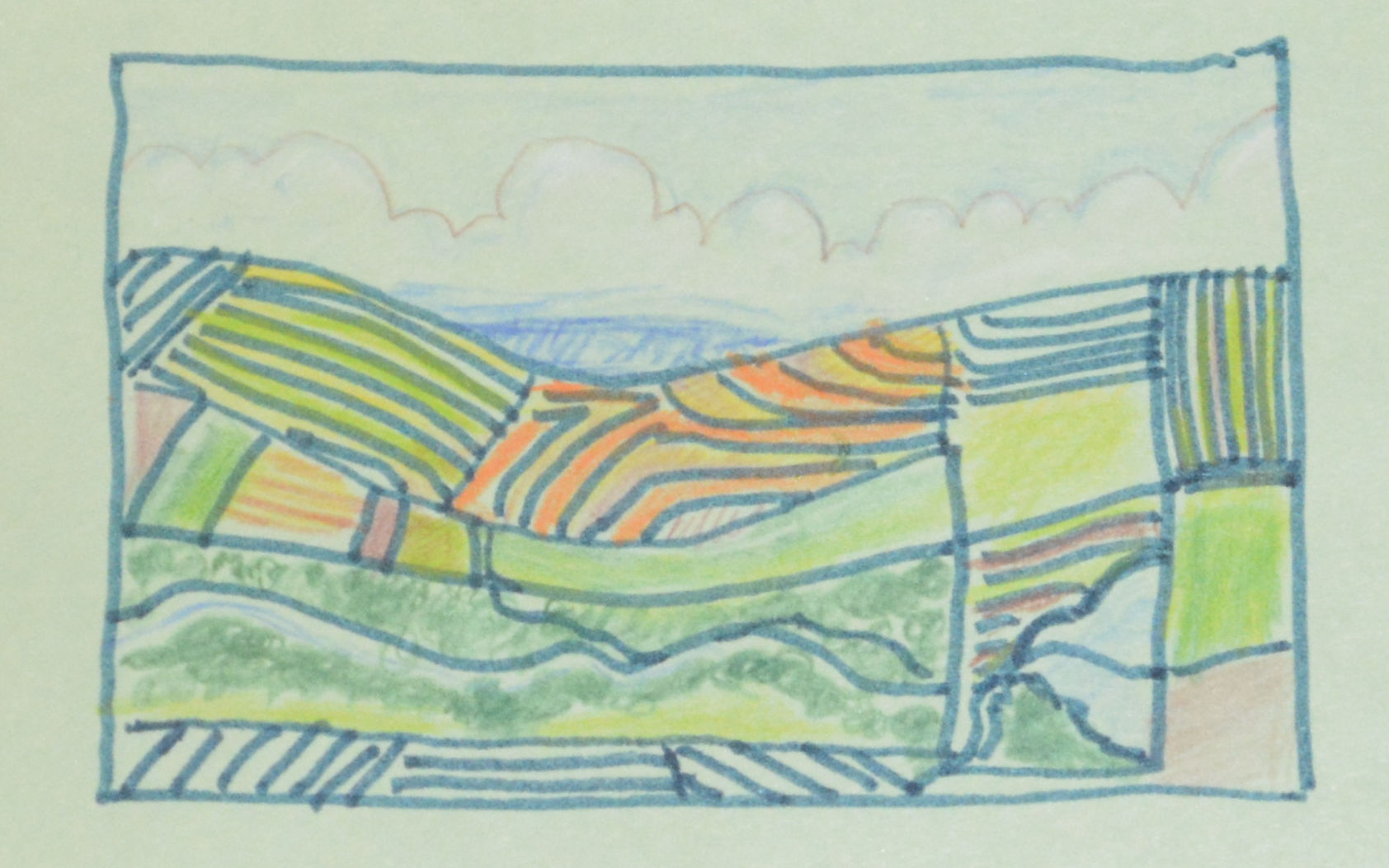
I”m not thrilled with it (why it’s not completely colored in, among other things) but I like the concept, and I like working in a small, well-defined space. Yes, there’s a river, and a reservoir, and a variety of crops, and some woods, but…even finishing the coloring won’t fix its fundamental problems on the right side, and my white pencil barely shows the cumulus cloud structure, thanks to the green background. OTOH it was fun and made good “breaks” in the writing work now and then. I’d fill one section then let it sit, then later another one. Other doodles of the week were all scratchy B&W, inspired by fighting with a ballpoint until it agreed to write again and then seeing what I could make of the strong up-and-down-slanted strokes of the “YOU WILL WRITE!” argument. As soon as I “crossed” them with scribbles they looked like a coniferous woods (sort of!).
None of this is great art. It’s mind-cleansing when stuck, though, and that works for me.
Apr 07
Posted: under Collections, Deeds of Youth, E-books, Life beyond writing, Progress, the writing life.
Tags: artwork, progress report, the writing life April 7th, 2023
…I don’t yet have permission to reveal it, and I can’t figure out how to make it show up in an email (did a test with a friend…got the link but it did not work) and clicking on the image itself, with this computer, doesn’t yield the “copy image” choice. It just enlarges or goes […] [...more]
…I don’t yet have permission to reveal it, and I can’t figure out how to make it show up in an email (did a test with a friend…got the link but it did not work) and clicking on the image itself, with this computer, doesn’t yield the “copy image” choice. It just enlarges or goes back to the other size.
What cover? you ask. The cover for Deeds of Youth. Tara, the designer, found a really good green-leather background for it, that will go with the dark red of Deeds of Honor. Cover uses the same font for the title, the gold stuff is all gold just as it was, and between the change of title and a II added to the line “paksenarrion world stories” people should not confuse I and II. When I get permission to share, and when I have loaded Paint Shop Pro into this computer so I can play with images in the software, I’ll post it. I like it a lot!
Meanwhile, the busy (but not organized) brain has worked out why King Mikeli’s being so stubborn about something in Horngard I, and who can unstick him a couple of weeks earlier, thus not having a long, long stretch that my agent thinks is dull for readers rather than tedious for one of teh characters. Of course Dragon’s quick idea to mmph the ;ukmph into the xzllz is still a bit of a problem….and creates other problems, which is always good for the plot unless it convinces readers it’s totally impossibly stupid and a creature like Dragon would never think of it. (Oh, yes he would. Did.)
Will there be other exciting news over the next few weeks? Probably not, but not *certainly* not. Agent is headed for the London Book Fair later this month for a couple of weeks of connecting with his foreign (to us) fellow agents in Europe and getting their input. He’ll be at the Nebulas in Anaheim not long after he gets back. I’ll be working on that little blobby bit in Horngard I and also posting more.
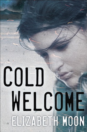
Jan 20
Posted: under artwork, Cold Welcome.
Tags: artwork, the writing life January 20th, 2017
Today’s the day Orbit UK is releasing the cover art for COLD WELCOME so here it is. If you want to see it in a larger format, it’s over at the Universes blog. The Universes post has both this cover and the US cover in a larger format, plus my amateurish “concept” sketch in crayon, […] [...more]
Today’s the day Orbit UK is releasing the cover art for COLD WELCOME so here it is. If you want to see it in a larger format, it’s over at the Universes blog.
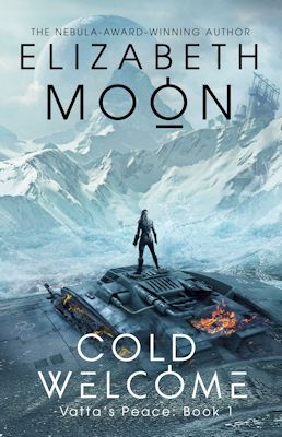
The Universes post has both this cover and the US cover in a larger format, plus my amateurish “concept” sketch in crayon, that looks nothing like either of them. For a good reason. I’m not a professional artist <G>.
Oct 16
Posted: under artwork.
Tags: artwork October 16th, 2015
As I told you awhile back, I met a talented artist at KeyCon (Winnipeg) back in May of this year and commissioned her to do a portrait of Admiral Kylara Evangeline Dominique Vatta, or Ky as most of us know her. I think she did a great job. It took awhile, because she had to […] [...more]
As I told you awhile back, I met a talented artist at KeyCon (Winnipeg) back in May of this year and commissioned her to do a portrait of Admiral Kylara Evangeline Dominique Vatta, or Ky as most of us know her. I think she did a great job. It took awhile, because she had to finish the school year (she teaches in a high school) and then had something else to finish, and various other things happened, but here it is.
Read the rest of this entry »
Aug 18
Posted: under artwork, Reader Help.
Tags: artwork, reader help wanted August 18th, 2015
The talented Canadian artist who’s working on a portrait of Ky tor the website needs to know what Space Defense Force insignia looks like. I don’t recall if I ever specified, but if I did, someone will notice if it’s wrong in the picture. I know Stella got involved at some point, but I can’t […] [...more]
The talented Canadian artist who’s working on a portrait of Ky tor the website needs to know what Space Defense Force insignia looks like. I don’t recall if I ever specified, but if I did, someone will notice if it’s wrong in the picture. I know Stella got involved at some point, but I can’t remember which book even, let alone where in it (Stella helped design Ky’s uniforms, but they already had a logo they got in…um…that place they were before the battle at Boxtop whatever-its-number-was.) It’s probably in Command Decision or Victory Conditions, but I can’t even find a copy of Victory Conditions right now (since I’m at a critical point of the new one…which has eaten most of my processing capacity…)
If anyone has time to do some rummaging in the books, that would help immensely. Realsoonnow would be great. Negative data ideal (artist & I can make it up de novo.)
Thanks to anyone who can throw a crumb to us so Lana can get this done. (I saw her work and met her at KeyCon in Winnipeg. And she was able to get a screen capture off an TV ad that had pretty much the perfect Ky in it. )
Apr 05
Posted: under artwork, Collections.
Tags: artwork, the book business April 5th, 2014
First, the warning: This is not the final, approved cover design. We may be tweaking it in several ways before sending it off for approval (which may not be given.) Shifting things up, down, sideways a few pixels. Fiddling with the “shine” on the letters. Etc. People should not get attached to […] [...more]
First, the warning: This is not the final, approved cover design. We may be tweaking it in several ways before sending it off for approval (which may not be given.) Shifting things up, down, sideways a few pixels. Fiddling with the “shine” on the letters. Etc. People should not get attached to it yet. For that reason, I’m putting it below the cut, and I’m not calling attention to this post on Twitter. Although this is my design idea, working with Illustrator ™ is not in my skillset, so all the actual manipulations of design elements to get to this point were done by my very talented friend Ruta, at Willowbrook Designs. So this is not a picture to be shared widely. I’ll post a final cover design when it’s all tweaked and has been approved.
What you’re getting is a Private Preview Director’s Cut kind of design. Read the rest of this entry »
Apr 03
Posted: under artwork, Collections.
Tags: artwork April 3rd, 2014
Years back, when I first set up the Paksworld website, I drew the border design I wanted as a header for it, and then–because I didn’t know how–hired a friend of mine who had worked for Richard Garriott on Ultima Online to render it as a vector image I could use in various ways. When […] [...more]
Years back, when I first set up the Paksworld website, I drew the border design I wanted as a header for it, and then–because I didn’t know how–hired a friend of mine who had worked for Richard Garriott on Ultima Online to render it as a vector image I could use in various ways. When the notion of doing some short-fiction collections related to Paksworld came up, I immediately wanted to use that design–modified to be a book cover design, not a website header design–on the covers. Read the rest of this entry »