First, the warning: This is not the final, approved cover design. We may be tweaking it in several ways before sending it off for approval (which may not be given.) Shifting things up, down, sideways a few pixels. Fiddling with the “shine” on the letters. Etc. People should not get attached to it yet. For that reason, I’m putting it below the cut, and I’m not calling attention to this post on Twitter. Although this is my design idea, working with Illustrator ™ is not in my skillset, so all the actual manipulations of design elements to get to this point were done by my very talented friend Ruta, at Willowbrook Designs. So this is not a picture to be shared widely. I’ll post a final cover design when it’s all tweaked and has been approved.
What you’re getting is a Private Preview Director’s Cut kind of design.
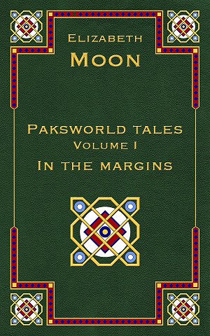
The other volumes will of course have different subtitles and different colored backgrounds. In my dreams, the four (estimated) volumes would all be published as fancy narrow leatherbound books, on good paper, with this border design, and–just to show that a writer’s ego is not bound by reality–gold edging on the pages, as in some old books I have. I won’t go so far as deckle-edges, because in my part of the world deckle edges are the delight of household insects. Maybe leather-look embossed heavy paper covers? Good quality old-fashioned cloth with sewn signatures? Yes, I’m a dreamer.
If you absolutely, positively, without the shadow of a doubt, hate this design, by all means tell me. If it’s going to anti-sell books, than it has to go…but my guess is it will attract the right sort of readers. If, on the other hand, you really-really like it, let me know that, too. In case of push-back in other quarters, knowing the already-existing Paksworld readers like it may help keep it.
Comment by Fred — April 5, 2014 @ 11:49 am
Hi!
Overall, I think it sounds the tone you want.
I have one little quibble, though.
I work in a field that’s rife with jargon – for those of us in the field, we all understand it, so it helps make communication faster and more accurate. I suspect that you might sell more books with something like “Tales from Paksenarrion’s World” – “Paksworld” feels like a shared shortening, in other words, jargon.
If I were a reader who had just been introduced to and read “The Deed of Paksenarrion”, and I went to Amazon or Google, and searched for “Paksenarrion”, I’m not sure that “Paksworld” would show up.
It might also be more descriptive to the not-yet-a-fan reader to say something like “Tales, Myths, and Legends of Paksenarrion’s World”
It could also be that I’m overly sensitive to such things…
As far as being a dreamer is concerned, my main dream is acid-free paper. I have lots of classic SF and Fantasy paperbacks which are going brown and delicate. Old friends should not age unavoidably.
And to put the cherry on top of all the dreams, leather-bound – yes, gold-edged – yes, and letterpress… (And now I’ve revealed myself as a bit of an antiquarian!)
All the best to you and yours,
Fred
Comment by Daniel Glover — April 5, 2014 @ 12:04 pm
I sort of agree with Fred about the title. But only sort of. Since the Paks only shows up once or twice a book in the most recent series, those purchasing and following Author more recently will likely know about the others and the more recent name for the world.
I like the cover. It does give it the “antiquey” look to go with some of the “deep history” stuff that the volumes will contain.
Comment by Joyce — April 5, 2014 @ 2:41 pm
Love the cover—that look would draw me to it like a hummingbird to nectar! As far as the title, using the whole name Paksennarion might be helpful to some, off-putting to others, so I guess I’m neutral on that.
I’m looking forward to the end of May very much, and also to these new stories. I read too quickly to get much pleasure from short stories, so never buy them, but I will certainly make an exception for these volumes.
Comment by Leo — April 5, 2014 @ 3:06 pm
I love the pattern and the look. I would love to have these (and ALL of the paksworld books) in leather, with the ribbon and gilt edge, good paper, etc etc.
Comment by Lise — April 5, 2014 @ 4:03 pm
I love it! I just worry that overly fancy printing/binding may push it out of my price-range.
Comment by Susan Malcolm — April 5, 2014 @ 4:47 pm
It’s beautiful, and I think it will draw readers, too. I do share Lise’s concern about the price being higher with fancier printing, but then I’ll be buying it for my Nook anyway.
Comment by Richard — April 5, 2014 @ 5:02 pm
First reaction: like the idea of a border, like the actual border, but the overall layout isn’t quite right, it jars, it is out of balance (vertically). The large medallion, being so prominent, ought to be central, though not necessarily dead centre.
This isn’t a strong enough feeling to be an anti-sell.
For a real archaic look, shouldn’t a lavish spine be the most important part of the cover? (Says I, tongue in cheek, realising it wouldn’t work for e-book)
Comment by Dave Ring — April 5, 2014 @ 6:22 pm
I like it a lot. Hope you (and publisher) go with it.
Comment by elizabeth — April 5, 2014 @ 6:25 pm
Comments noted, and thank you.
Since this is intended as an e-book release, and the requirements of the various distributors and e-readers impose restrictions on the pixel display of a thumbnail, the title must be at least recognizable (if not clearly readable) in the thumbnail size. I’ve been listening to friends who’ve done the same kind of thing, and the advice is for shorter titles. Paksenarrion is, unfortunately for this purpose, a long word mostly made up of wide letters (rather than a string of /i/s.)
So after talking to others, and the packager, I went for Paksworld, which I’ve been using in discussions for several years now…enough, I think, to make it more familiar to readers who’ve read any of the other books. Also I have the 50 words for book description.
Should we ever get a print edition (no guarantees!) we’ll just have to see what prices are for various options.
Comment by Kathryn Flaherty — April 5, 2014 @ 7:20 pm
I love the cover. I also like Paksworld instead of Paksenarrion’s World. In my head the books have always been Pak’s books because very few people ever refer to her full name. The only thing that grabs me is the motif. I’d put it between your name and the title but that’s a personal preference.
Comment by Tuppenny — April 5, 2014 @ 8:07 pm
The center motif is a bit ‘heavy’ in that it grabs the eye more strongly then the title does. White draws the eye much more strongly than the thin gold of the letters.
That said the overall look is very appealing.
Comment by elizabeth — April 5, 2014 @ 9:08 pm
We’re going to go with bolder lettering; I’ve got a rough mockup in Paint Shop, which Ruta will adjust in Illustrator. That should help. We tried removing the white from the medallions, but then they looked dull and far less interesting, since the interlacement part isn’t particularly intricate. (There was a reason for that, involving use of the design in different sizes down to business cards and thumbnails.) The white makes them sparkle. I have some old books that use white in their cover design with the same effect.
Where the medallion goes is a matter of fashion, in a way. There are old books–esp. from the art nouveau period–that have an elaborate lower design, with title and author in the top third, or the title (large) there and the author (small) at the bottom. Some of you will have seen (or own) clothbound books with a picture embossed on the cover, including at least partly colored, some with the picture generating a narrow border up the spine-side and along the bottom, with a separated top border. There are older books with a (smaller) center graphic design (usually but not always some form of circle, or an image like a running hound, crossed swords, coat of arms) and the title above and author below. In old books, the author’s name is the same font size throughout. (There were fewer writers!) Modern usage often puts the author’s name, last name larger, at the top, though sometimes at the bottom–both to make it easier to see, and because of the emphasis on “branding.” The idea is that readers now follow writers, and thus the name becomes the brand, rather than the title.
That’s the way my publishers set up mine (and a reason to continue it, again because of reader familiarity with that format) though they differed on how they placed the title. Baen did the SF with name and title both at the top, image below/behind to show off the artwork. Del Rey has put name at the top, title below for the fantasy, showcasing artwork in the middle.
Comment by jjmcgaffey — April 5, 2014 @ 10:48 pm
I like it – it looks good. I can see the quibbles, but if I saw that on a shelf, or a screen, I’d look more closely (and then I’d see Elizabeth Moon and grab it!). Paksworld is likely to be familiar to those who follow Elizabeth and Paks closely, and interpretable to those who follow less closely – though yeah, for search, Paksenarrion needs to be “visible” (description should work fine).
The idea of a set of these with different background colors is fantastic. This dark green is gorgeous, but – dark red, deep blue, leather brown…yum. I don’t buy hardcover books – too expensive for what I get – but for that I’d be tempted. And if they came out in a paperback set with this cover, I’d grab them. Ebooks, of course, right away (though less for the cover than for the contents…).
Comment by Richard — April 6, 2014 @ 2:38 am
Green with yellow: Halveric-Lyonyan colors.
Comment by Naomi — April 6, 2014 @ 2:47 am
Love it
Comment by Chuck Gatlin — April 6, 2014 @ 6:55 am
I really like the design, especially when imagined with the mods Elizabeth has mentioned. I wonder if a version with fewer colors, stamped on cloth, might not even better communicate the antique feel of the older books she mentions?
Comment by Genko — April 6, 2014 @ 9:07 am
Beautiful! And “Paksworld Tales” is a wonderful title. The word “tales” to me encompasses myths and legends. I agree about somewhat bolder type would help. The colors are really lovely.
Comment by Kerry aka Trouble — April 6, 2014 @ 2:20 pm
Love the look, but it REALLY needs to be a leather-bound gold-embossed book 🙂 Just my $0.02.
Comment by Annabel — April 6, 2014 @ 3:38 pm
Love the cover! And because it’s for an e-book, you can make it look really leathery and antique-y (is that a word?).
Comment by GinnyW — April 6, 2014 @ 4:12 pm
I really like the cover. It definitely fits the “archive” atmosphere I associate with having side and back stories collected in collections of short works. The idea of using the same cover with different color schemes for other books in the same series works well for me. It makes it easy to spot the next one, especially if I first see it as a thumbnail.
The medallion position is OK for me. As you say, it follows a convention I associate with books that belonged to my parents and grandparents. I have no strong convictions about it though.
Thanks for the preview!
Comment by Jonathan Schor — April 6, 2014 @ 7:28 pm
Looks nice as long as the price does not scare people away.
Tales – prehensile?
Comment by elizabeth — April 6, 2014 @ 7:37 pm
Jonathan: “Gripping” tales anyway…
All: Remember, it’s coming out as an e-book only at first, and maybe forever. Depends.
And it should not break anyone’s bank.
Comment by elizabeth — April 6, 2014 @ 10:14 pm
Oh, and the first one’s green with gold because the website and blogsite header designs have a green background. Connectivity or something. The website colors subtly suggest other important colors as well as the green for elves and Lyonya and as part of some other families’ colors, though I couldn’t work Mahieran rose into it–it looked ridiculous. But the Verrakai and Girdish blues, the Falkian and Marrakai red (and green), the white for both Girdish and Esean religious reasons.
I thought of doing all the collection volumes green, but Lisa said “Would you consider different colors so people will easily tell they’re not the same one?” and I said “Oh–of course! And blue and red and…um…brown.” We’ve been tinkering with textures and colors and I have more to look at, but it’s late and I’m tired. Sang two services today and even a nap hasn’t restored my energy…Howell is a difficult composer for me to sing well, and I didn’t make my own standard.
Comment by pjm — April 7, 2014 @ 7:13 am
I like the cover – almost. I don’t know why it doesn’t quite gell for me – I am not analytical enough about visual impressions and such. Also I wonder how well it will work when scaled down to the sizes used in ebook stores.
Mind you, the cover picture is not going to make much difference to me when I buy it.
If book 1 is “In the Margins”, would book 2 be “Between the Lines”? Probably not, but “Between Chapters” might work. (or not!)
Peter
Comment by elizabeth — April 7, 2014 @ 7:48 am
pjm: You have hit on one of the main considerations of modern book design: how recognizable will it be when scaled down to the thumbnail used in ebook store? That’s why the main title uses “Paksworld” instead of the longer “Paksenarrion’s World” and the border and medallion design is so simple. Author last name (at least) and title need to be readable at the smallest size it will be displayed. (Hence, we’re changing to a bold font in the next iteration.)
Back when I started in this business, I was firmly told that the purpose of a book cover is to sell books–which means attracting the right kind of reader for that kind of book. It should not repel them (as the “romance-y” cover for the US Kings of the North did some of you), but indicating the right kind of book is more important than having all the readers wild about the cover. Writers sometimes know things about their readership that the publisher doesn’t (and vice versa), so either writer or publisher may favor a cover design that does not work for the readership–it invites readers who won’t like the book, or it repels readers who would have. Some readerships are more demanding in this regard. Personally, I’d just as soon have all books in plain covers with maybe a little graphic decoration, so readers would have to read a page or so to find out if this was going to be their kind of book. I’ve been turned off by covers, only to discover later that I’d missed a book I would have liked then (but found years later in a friend’s bookcase when it was out of print.)
Comment by Iphinome — April 7, 2014 @ 8:32 am
@pjm and @Lady Moon
I think it doesn’t gel because a cover that simple says self published (or 2’nd edition advanced dungeons and dragons class guide) it would be the same as if you saw a human on the cover made with poser rather than a painting or a Photoshopped photo of a human.
Here it hit the uncanny valley of being just close enough to right. Not being a design person I don’t know what changes would work, perhaps the colors are slightly too bright, perhaps the medallion should have a touch of shading to add depth perhaps not. I wish I had something constructive to add.
One other point though and please tell me if I’m completely off base but that image is book shaped, not ebook shaped. Erader screens use a 4:3 ratio the nexus 7s (and probably other tablets) use 16:10
Comment by elizabeth — April 7, 2014 @ 9:05 am
Iphinome: One of the problems of designing covers to work with e-books is that they don’t all use the same ratio (neither do paper books, but that doesn’t matter when the whole book is right there in front of you–and of course some formats *are* standard). There are standards for each e-reader and each of the main e-book online stores (such as Amazon & B&N & Apple) and the cover has to have the pixel size & density each wants. (And someone thought tech would make life easier…HA! It makes it easier here and more complicated there.) Those adjustments will be made when the final design is done. This mockup is to the packager’s required size (well…it’s scaled down from that, for use on the blog.)
As for the simplicity…we’ll just have to see how it goes. “Self-published” does not have the taint that it had even five years ago, especially not when a book or story is by an established writer. I saw a post on a closed writers’ group this morning in which someone had success self-pubbing short fiction in e-format, with just the default cover of whatever e-store it was on. That individual had enough name-recognition that a cover design wasn’t necessary. And–worst case–it’s not that hard to change a cover on an e-book.
Comment by MaryElmore — April 7, 2014 @ 4:08 pm
I really like the cover. It will work in the colors you have mentioned.
Comment by GinnyW — April 7, 2014 @ 6:53 pm
I only realized this because of the discussion concerning the green color, but my browser shows the background as black, unless I expand to full screen view. That may be a consideration as you tinker with it.
I think the graphic design will readily adapt to the requirements of whatever e-format you use. More readily than a portrait anyway. The center medallion is vary-able too. For example, the small circles could be Girdish cresents (or whatever fits the collection).
Comment by elizabeth — April 7, 2014 @ 7:35 pm
GinnyW: I wonder why–what browser are you using? We haven’t seen that with either my PC or Ruta’s Apple and it’s important to know.
The display at Amazon.com will be done by Amazon–they require a certain (LARGE) size and then shrink it to thumbnail themselves. I suspect other sites do something similar, so I won’t have any control over how it appears there.
Comment by Richard — April 8, 2014 @ 3:07 am
A different page ratio (as per #26) will destroy the main medallion’s diagonal alignment to the bottom corners.
Peter (#24) I can imagine Elizabeth having something else in mind for volume 2’s title.
Comment by Mette — April 8, 2014 @ 6:25 am
I really like the design. The only thing I might change (and I haven’t read all the comments, so don’t know if it’s been said already) is that I would make the connecting line between the two borders a bit thicker. To me it looks too fragile in an otherwise “heavy” design. But I am in no way a designer, so you shouldn’t necessarily listen to me.
Comment by elizabeth — April 8, 2014 @ 8:35 am
Richard: I certainly do intend a different subtitle for each volume, another way (besides color, in case someone’s on a B&W system) to distinguish them. (Volume number does that, but I thought subtitles should be different.)
Comment by GinnyW — April 8, 2014 @ 1:23 pm
I use Firefox. The black color was on my desktop, which is relatively old, about 10 years now. It comes up green on the laptop I am using in the library. I have no idea what the difference is, although I think the screen on the (much newer) laptop may be backlit.
Comment by Daniel Glover — April 8, 2014 @ 2:53 pm
Ginny,
It might be your monitor. I’ve got a monitor that the red tends to drop out if the cable is jiggled. So things go “black” for the reds. It might be that for your greens. I need to get a new monitor. 😉
Comment by elizabeth — April 8, 2014 @ 5:18 pm
GinnyW: It’s a dark green, and looked blackish on my old desktop monitor until I cranked the brightness up to max. Should mention that the monitor is an ancient Dell (don’t know how old) because my previous monitor died after 14-15 years. Silly thing.
Comment by pjm — April 8, 2014 @ 6:52 pm
Richard (#31), I can too. Even if titles follow the theme, “margins” has wider and more relevant meanings than the side of a page. “Between the lines” just jumped out of my warped sense of humour. But wouldn’t you enjoy saying to someone, book in hand, “I’m reading between the lines”?
Peter
Comment by Richard — April 9, 2014 @ 3:41 am
Daniel, if jiggling the cable messes up your monitor, try a new cable. It worked for me three or four years ago on my now 12-year old flat-screen monitor.
Comment by Linda — April 9, 2014 @ 6:46 am
I agree with Mette that the lines connecting the corner elements should be heavier, thicker, whatever.
I have friends who are binders … all sorts of interesting “book art” comes from their studios. I can imagine an offshoot of their work in printed versions of e-books with custom paper, covers etc.
I used to do fore edge paintings on some of my favorite books when time lay heavy on my hands (when was that?). Remember J
K Rowling doing the bejeweled versions of Tales of Beedle the Bard for a very select group?
I think that a special binding with fore edge painting and letter covers etc. would make a far more impressive “gift” than a plaque or medal for those who win major honors in the literary field.
Comment by GinnyW — April 9, 2014 @ 12:37 pm
Richard, thanks for the suggestion about the cable. This monitor has gone out unexpectedly twice now, usually from vibration.
Comment by Richard — April 9, 2014 @ 5:01 pm
I like the thin sections of line down the sides.
Comment by elizabeth — April 9, 2014 @ 11:26 pm
Why are the lines thin?
A) Wider lines did not look good in reality; these lines are as wide as the gold borders on either side of the red-and-blue one. Yes, of course we tried lines of different widths.
B) Thin lines allowed us to increase the font size of the title without crowding it on the ends.
C) I like the thin lines and think they look elegant, and lighten the design as a whole. Similar thin lines are used on books of the period this design emulates.
Comment by Kathleen Hanrahan — April 10, 2014 @ 12:27 am
I like the cover and look forward to seeing the other colors as well. The version in leather with gilt-trimmed edges sounds perfectly yummy!
Comment by Eowyn — April 15, 2014 @ 2:47 pm
I like the design and the interlocking pieces. I do wonder what it will look like on a B&W reader and if that will affect anything. The colors and patterns make me think of a fantastical world which is what you want.
Comment by patrick — April 16, 2014 @ 6:36 pm
I hope it makes a printed format as I don’t have an ebook reader and like the traditional format.
Because it comes from a trusted author with an established world setting, I would be happy to buy a trade press edition at trade press prices (i.e. double mass market prices). But then I’ve been preordering hardbacks of the latest series when I normally just buy mass market, so I may not be the best measure of the winning price point.
Comment by Andy — June 18, 2014 @ 9:47 pm
I like design. It fits well with the period. Possibly the spacing between Moon and the title line could be reduced to tweak the vertical spacing ?? It may just be me but the central medallion seems to crowd the lower border just a bit. The overall effect reflects the stories and mood of the blog.