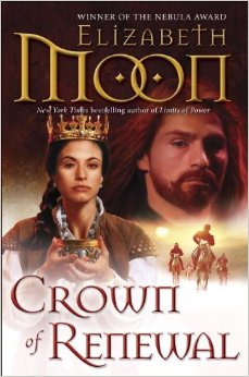
Since Crown of Renewal’s covers, US and UK, are on display at their respective Amazon portals…there they are side by side for your delectation.

Both covers required a little change from their original form, which is natural since artists don’t have time to read a monster book before working on the cover (in fact, the cover art needs to be done before the book’s even turned in, sometimes–Amazon and other booksellers want to see the cover before they start making up their catalogs and making orders.)
Comment by Ed Bunyan — December 3, 2013 @ 4:44 pm
I like the line Power must be earned on the UK copy. Can’t wait to get my hands on this tale.
Comment by Kathryn — December 3, 2013 @ 5:24 pm
I like the U.K. cover! The U.S. ones are all starting to blur together for me, well-done though they are. The crown is tantalizing, though, I have to say!
Comment by Jonathan Schor — December 3, 2013 @ 7:05 pm
Crown of Renewal – So Keiri has to go back to the dentist.
Sorry, could not resist. I still think that all of the titled should have continued the Oath theme of the first four books.
Hope everyone had a good long weekend.
Comment by Wickersham's Conscience — December 3, 2013 @ 7:15 pm
The UK cover is different because there is only one queen in England or something?
Comment by Iphinome — December 3, 2013 @ 7:29 pm
Is that a studded jerkin he’s wearing on the UK cover? Anyone have a higher res image?
Comment by LarryP — December 3, 2013 @ 7:51 pm
I think it is a brigantine armor which is velvet over either plates or mail backed by leather.
Comment by elizabeth — December 3, 2013 @ 10:43 pm
Kathryn: The future of bookselling may be a machine that reads the reader’s mind and is able to instantly display the perfect book cover for that reader and that book. If that comes to pass, authors will still look at some of their book covers (as fitted to this reader or that) and mutter “How could anyone think THAT represents my story???” And sometimes the author will be thrilled and pleased and bouncing up and down but readers (or some of them) will react to the cover negatively.
I sometimes think we should go back to plain covers with just the title and author (or just the title) on the book so readers can’t be misled, dismayed, etc. I saw something on a friend’s blog today (Sharon Lee and Steve Miller–who by the way are offering a contest for free audiobooks of their newest. –one of their fans mentioning a reluctance to pick up that writer’s first book because it had a giant turtle on the front…and now they like the giant turtles, but they didn’t expect to. I never saw that edition of their book, so I never saw the giant turtle (which may not have looked anything like the Clutch Turtles anyway) so I ran into Edger and Sheather without any artist’s interpretation between me and the characters.
Comment by elizabeth — December 3, 2013 @ 10:48 pm
Ed: The line doesn’t come from the book, though.
Jonathan: GROAN. Also, you have no idea how hard it is to come up with a title that fulfills everyone’s desires. Author, editor, marketing, booksellers, publicity…everyone has an opinion and very often they don’t agree. Titles get worked over until they’re like a mouthful of mashed potatoes you’ve been chewing…and chewing…and chewing… While titles in a series should generally have some relation to one another, they also need to have resonance with more than one level of the story to that point, and final volume titles need to connect to the whole arc, which is about to be revealed.
Comment by elizabeth — December 3, 2013 @ 10:55 pm
Wickersham’s Conscience: All the UK covers have been different from the US covers. They wanted to go back to Kieri for the cover.
Iphinome & LarryP: I don’t know, and I’ve seen the higher res, larger picture. It looks like “artist’s idea of historical outfit suitable for this cover.” I like it well enough–it’s an attention-grabbing cover and will help sell the book, I think. People seeing that are not going to be surprised that there’s violent content. Looking at the early version I was concentrating on ensuring that this time Kieri got a beard (he wears a beard, dagnabbit!) and Dorrin didn’t look like a seductress.
Comment by elizabeth — December 3, 2013 @ 10:56 pm
And I should add: I like the way the crown appears to rest much more lightly–barely touching–than a crown of that size and weight would. Magery is SO helpful in these practical matters.
Comment by Iphinome — December 3, 2013 @ 11:21 pm
Fair enough but when the movie comes along the costume department is going to have a problem with that cloak. They’re going to have to hide a couple of pins on the shoulders and maybe one at the back of the neck to hold the weight. Otherwise it looks like it’ll pull back and choke the actor.
On the other hand Dorrin’s white shirt is quite nice. I’m tempted to sew a copy.
Comment by jjmcgaffey — December 4, 2013 @ 2:14 am
Heh. I missed the someone complaining about the Agent of Change cover completely – it looks like this (if I can put a link in here) – http://pics.cdn.librarything.com/picsizes/22/d2/22d27fa134d48fa596d754665774141414d6741.jpg .
I like both these covers. Yeah, I am having a little trouble with the US covers looking too similar…but then, once I’ve got the book, I don’t spend a great deal of time looking at the cover. It’s the inside I like!
And Kieri not only got a beard on both of these, it’s the _same_ beard. Very nice.
Comment by Richard — December 4, 2013 @ 3:54 am
Didn’t the aforementioned Liaden cover come out just when the Teenage Mutant Ninjas were an “in” craze – and other people’s bête noire?
Comment by Gareth — December 4, 2013 @ 6:00 am
I have no problem with different US and UK covers though I have to say for this series I prefer the UK (maybe they got the target audience right!)
What really does annoy me is when they use different titles in different territories. I’ve more than once seen a new title by an author I know and grabbed it without taking the time to dig inside only later to find it’s the same book I read some time before.
Sort of OK when they put out big paperback editions with several books in one volume, but when you do it with a single book it annoys.
I guess I’m unusual in that I spend about one week in six in the US, the rest (mostly) in the UK.
Comment by GinnyW — December 4, 2013 @ 9:08 pm
I like both covers. The action in the UK cover is attractive, but at this point in the series I rather like seeing the regalia in the US cover. (Or at least seeing an artist’s rendition of the regalia in action.) I like the title, too. “Crown of Renewal” could describe either the story arc about Dorrin and the regalia, or about Kieri’s effect on Lyonya (and Lyonya’s effect on Kieri). It picks up “Kings of the North” and “Limits of Power”. At least it does for me.
Now, I want to have the whole book.
Comment by Sharidann — December 5, 2013 @ 2:21 am
I also like both, with a preference to the US cover, albeit it is true that all the US covers of the series tend to kinda look alike alot.
Can’t wait to get my hands on the book, just need to time my reread carefully. 🙂
Comment by Jonathan Schor — December 5, 2013 @ 7:46 am
But the real thing concerning the covers is that by now it really does not matter – since the last book in a series is not the place to start, I have the feeling that most people will purchase it no matter what the cover. What does matter is that dim in my memory, I picked up the FIRST Paks book in part because of its cover AND because of the blurb on the back – I think I was attracted by Ms. Moon being an ex-Marine. In the end, the book has to stand on its words, not on its cover.
Comment by GinnyW — December 5, 2013 @ 8:12 am
If the covers follow a similar pattern, as the US covers do, it helps me to recognize the new book in a display of new releases. It is irrelevant if I preorder on line. For that process it is best to have a short but distinct title. (Limits of Power kept turning up in the second ten results, with a bunch of political science books ahead of it.) Of course, it is always possible to search for the author.
Comment by Linda — December 5, 2013 @ 9:02 pm
Funny, I find I sometimes react to the “style” of the cover more than the content. The almost photographic ones often seem to lack context … that is they don’t reflect the theme or tone of the books.
Like Elizabeth, I react badly to covers which contradict the story.
I am a person for whom violence on a cover is a threat … suggesting that I may not like the book if the violence dominates or seems gratuitous.
The too handsome or sexy figure (male or female) is also a turn off for me. I read and re-read to open my mind to worthwhile ideas and I rarely find them in books featuring torn clothing on their covers.
Going back to author and title on the cover wouldn’t trouble me, as I buy mainly e-books these days as I flit between my home and taking care of Mom every other week. I like to carry a library on my laptop.
Comment by elizabeth — December 5, 2013 @ 11:25 pm
I have tried to learn how to look at covers as marketing devices, not as pictures I want to own, or scenes from my mental movie of the story. Some styles of art have always attracted me, and some have always repelled me, and I have to fight that when faced with book covers. And people often have conflicting internal images of what things in a book are like or should be.
I am aware of the gendering of book covers–a subject of some discussion earlier this year–and have argued against/for elements I felt were sending the wrong message to potential readers, while at the same time fighting my own dislike of the obvious signals that “This is for girls…” or “It’s a romance, really…” in books on the shelves.
In the writers’ listservs, there’s always discussion about covers, and how covers affect sales, especially for writers early in their careers, when readers don’t yet have a sense of what a cover of, say, a rose, a crystal goblet, and a dagger on a carved table may mean in a book by that writer. (Is it a mystery? A gothic? A romance? Historical? Fantasy?)
For me, a cover may show a useful symbol related to the book’s story arc (a crown, a sword, a baseball bat, a sports car, a mansion, a briefcase, a bowl with batter dripping down the side…) If it shows a character, place, creature, thing, that character/place/creature/thing should be in the book, and the depiction should be true to the text.
It is beyond hope to get a marketing or art department to show a woman of middle age or older AS a woman of middle age or older…the belief that this genre is driven by teenage male readers (or female readers looking for romance) is still strong. And, to be fair, I’ve read on several big discussion boards comments from quite a few guys who still won’t read books by women (or claim to have tried but found them too touchy-feely.) So marketing has a reason for its attitude.
But having the females completely and appropriately clothed, not overly endowed unless they’re written that way, is certainly possible. Artists, as I’ve mentioned, don’t have time to read all the books they’re supposed to do covers for; they depend on what they’re told (commonly by someone other than the author.) They need to be given the information by someone who has read the book, at least enough to know if a character is young, middle-aged, old, timid, bold, etc.
Comment by Richard — December 6, 2013 @ 5:54 am
Elizabeth,
what plain covers with just title and author would not do is show instantly which of your books are Paksworld and which Vatta’s War. For the rest, I quite agree.
Wickersham’s Conscience: I’m not aware of any restrictions or inhibitions in the UK against depicting fictional queens or crowns. In any case, our real Queen has hoop crowns of four half-arches, with cap. See http://www.royal.gov.uk/the%20royal%20collection%20and%20other%20collections/thecrownjewels/overview.aspx if interested.
Comment by Celina — December 6, 2013 @ 6:49 am
Both covers looks really good! I have all the UK editions, since I live in Sweden, so I prefer to have a full set 🙂
And yeah, I kind of forgot Kieri have a beard, so I have always imagen him without one *giggles*.
Comment by Tuppenny — December 6, 2013 @ 1:39 pm
Isn’t Kieri supposed to be have red hair -fox colored?
Comment by elizabeth — December 6, 2013 @ 2:31 pm
Kieri has red hair, yes. I have mentioned this repeatedly when talking about covers. I have been told, when the cover art comes in, that the best they can do is add a little red highlights to it, which sometimes shows up and sometimes doesn’t. You can see it in the US cover this time.
Again: I do not have control of covers. I have a small amount of leverage which I try to use where it will do the most good.
I am now working on a project for the Paksworld website that will, I hope, show some characters as I imagine them, within limits. The first ones will be pencil B&W sketches that viewers can mentally color in for themselves. Later, if I can afford it, there will be some colored art. The first character should be up within the week, barring power outages and other storm-related problems. This will be a slowish project as the artist is working on my stuff between bigger contracts.
Comment by GinnyW — December 6, 2013 @ 2:37 pm
I try not to make too much connection between the descriptions in the book and the covers, because they rarely match. When I do imagine the cover as representing someone/some episode in the book, it is not necessarily the character or scene that the publisher or artist intended. But then, I do not like watching films made from books I really like, because the characters rarely appear on screen the way I imagine them.
As a general rule, I am happy with my own interpretations, and am willing to let others imagine as they see fit.
I am fascinated by the background in the UK cover, which I think perhaps resembles Verella, although I have no firm conviction on it.
Comment by elizabeth — December 6, 2013 @ 9:12 pm
One of the interesting behind-the-scenes things is that some artists want to work from a visual image–“He looks like X, this actor right here, except blue eyes…”–and some do not want that kind of guidance at all. I’ve been asked for pictures of crossbows, crowns, beards, shirts, doublets, etc. Oddly, artists all seem to have an idea of what a sword looks like, and most of them are more fantasy swords than working swords. (Not all, and it’s possible to get an artist to tone a sword down.)
Back when I wrote ONCE A HERO, I had designed, on my computer, the Deepspace Repair Ship Koskuisko…a truly weird spaceship, but the design made sense for what it was. And they didn’t ask me for my design or make any attempt to show it on the cover. I still think it would’ve been an arresting image.
That’s the one that started with the headquarters building of the EU–as it was then, anyway–only giving it another equal ring, stacking two Sydney Opera houses (one on each of the two main repair bays…the “shell” segments could open and close, and were functional cranes), a plumbing fixture out the far end of another wing (that was the Special Materials Fabrication Laboratory) and a few other goodies. I was having way too much fun with Corel Draw and its stock art collection.
Comment by Tuppenny — December 7, 2013 @ 6:58 pm
I do like the depiction of Arvid on the Paksworld site. Lock up the silver, and the daughters …
Comment by Sherri Campbell — December 11, 2013 @ 12:40 am
Most book covers are rather close to some aspect of the book… But I remember buying a book by Alan Gardner that was pure fantasy and it had a Darth Vader on the cover; of course that was just after Star Wars came out…
I do like the US covers… I also like the entire series has variations on the same art for the covers. Hate it when they “jump ship” in the middle…